OVERVIEW
Sawyer’s messaging feature is where children's activity providers communicate details and changes with their students about an upcoming class. The updated messaging feature radically improves the post-purchase experience by enabling providers to communicate with their customers in the best way they see fit.
MY ROLE
Design Lead
RESPONSIBILITIES
User research, problem definition, scoping, design, testing, handoff
TIMELINE
This project took place over 4 sprints between July 12, 2021 – Sep 3, 2021
BACKGROUND
Customer insights drive product strategy
In early 2021, I had begun conducting broad interviews to better understand our best-fit customers† and what they love about Sawyer— essentially trying to get to the essence of our product-market fit so we could focus our efforts on insights that would give us leverage in the market.
This broad research painted a clear picture of Sawyer’s best-fit customers, what they loved about our product, and why they cared.
👉 They are medium-sized business owners who both teach class and run day-to-day operations.
👉 They want a tool that streamlines administrative tasks so they could focus on educating.
👉 They found the most value in Sawyer’s customer registration experience because it was a critical touchpoint for their own customers.
† We interviewed customers with high NPS scores and positive Capterra reviews as a proxy for “best-fit”.

I summarized this research in a bite-sized format that could be shared with the whole company because ultimately, for product strategy to work, product, marketing, sales, all need to be in sync.
Our strategic guiding principle was therefore as follows:
If our own customers cared about their customers more than anything else, we needed to think about the end consumer to enable our customers to provide the best experience possible.
We hypothesized that if we really delivered on this insight, we would attract more best-fit customers with less effort, especially if our sales and marketing teams supported this vision.
DISCOVERY
Understanding the Registration Journey
As a team, we mapped out a journey of the customer registration experience from end to end. Together, we came up with distinct stages, listed all the touch points that occur at each stage, and described the expectations vs. realities respectively.
In doing so, we noticed a weak point in the journey that threatened the experience as a whole—we called this stage the post-purchase experience—and it represents the time between purchase and the actually class.
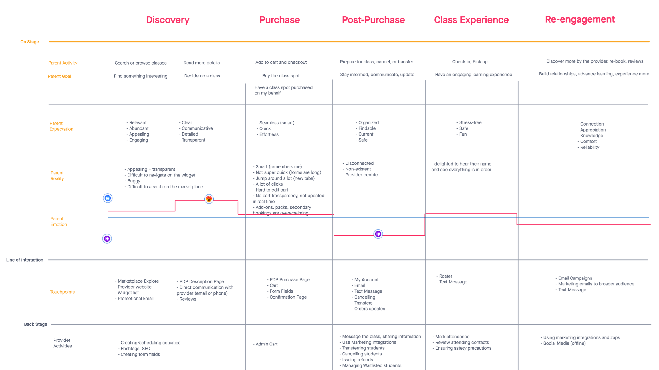
Journey map showing the entire customer registration experience and all touch points between our customers and the end consumer.
Post-purchase had some weak touch points, but most importantly, it had a ton of room for devastating errors. To ensure a delightful registration experience, we needed to account for the "invisible" interactions that occur between our customers and the end consumer at this stage.
I facilitated a workshop to generate opportunities in this stage and among the opportunities we generated, the common theme was undeniably around improving communications between our customers and theirs after a purchase had been made.
FRAMING
Focusing on the right communication
At this point we had identified a problem space, but we needed to understand the communications landscape better to focus our efforts.
Sawyer already had a very basic messaging feature that we were able to leverage to collect some initial data. We conducted interviews and in-app micro surveys that were triggered after a message was sent to better understand the current and desired use cases for this functionality. We also explored communication behaviours from alternatives like gmail and text messaging.

Sawyer's old messaging feature enabled providers to send a plain text message to the entire class.

Micro surveys fired after a message was sent with the old messaging feature to capture use cases and user needs.
From this research, we learned that our customers communicate with their customers in 1 of 3 ways. We labelled these categorizations as follows:
Announcements
1 way communication
Audience is the size of a class
Provider initiated
Content is about an upcoming class
Urgent
Marketing Emails
1 way communication
Audience is very large
Provider initiated
Content is about a selling
Not urgent
Dialogs
2 way communication
Audience is 1 person
Parent initiated
Content is focused on solving issues
Urgent
We decided that our focus for this project was to solve for “announcement” type messages for various reasons.
1) we believed we were best positioned to solve this problem effectively—announcements were typically sent to a rotational list of students, only accessible in the Sawyer platform. Furthermore, Gmail and Mailchimp were commonly used as tools to solve the other two types.
2) by enabling our customers to send announcements about an upcoming class, they could keep their customers well informed, and ensure a great class experience.
FIRST RELEASE
Solving for Announcement Use Cases & Needs
From our research, we were able to understand the use cases and needs our customers had for sending announcement type messages.
Use Cases
👋 Welcome emails
⏰ Class reminders
✅ Class details
⏳ Last minute cancellations
🗓 Schedule changes
🎟 Class spot openings
📚 Homework assignments
🙏 Thank you notes
Customer Needs
🎛 More specificity who receives the message
📣 Keep administrators informed
🔗 Include more information (outlinks, attachments)
🎨 Highlight key details
✉️ Message format options (text, email)
The new interface effectively solves the announcement problem by accounting for both customer use cases and needs.
The UI is split into two equal sections for an easily digestible task flow.
On the left, you can control who receives the message, adding specificity where appropriate. This includes:
• Registration status
• Which contact you have on file
• Custom selections
• Handy customer attributes related to the class
• Cc’ing capabilities to keep your instructors and administrators in the loop
On the right, you have a composition area that shows a preview with rich text formatting and attachments so you can add as much detail and customization as you need to get your message across.
The mobile design follows the same two-part structure, but is simply broken up into steps.
->
See the UI iterations for the first release ✏️

The first release of the new messaging UI gave users much more recipient specificity and allowed rich formatting and attachments. This gave providers control over the message's "who" and "how" so they could cover all the aforementioned use cases.
EDGE CASES
Errors, Failsafes, & Maximums
Below are some error states that display when required fields are not selected. We also accounted for system maximums (extreme cases and file sizes).

Edge cases accounted for to prevent user errors.
TRADE-OFFS
Message Methods
A popular request was the ability to send text messages to the class. However, text messaging cost up to 10x more than automated emails and when we modelled the potential costs and considered our customer’s tendencies to blast messages to their entire lists, we opted to remove it from the initial release.

POST RELEASE
Measuring Success
Shortly after the first release, we triggered a second micro-survey to quantify the change in satisfaction score and collect additional insights.
->
See the survey themes here 🔍

The second micro survey was intended to quantify improvement and capture anything we had missed in the first release.
Here are the summarized results we collected after the first month
1) Feature satisfaction increased by 9%
2) Feature usage increased more than 100%†
We also got some really great qualitative feedback from this survey that gave us insights on how to further improve it. Among these, the most common request mentioned the ability to copy the list of recipients directly from the interface‡.
† Upon release, we sent out a marketing email to inform users of the update, which likely accounts for the increase in usage.
‡ Sawyer's old messaging UI actually had this feature, but we removed it because we found it to be redundant given the new design. When we followed up on this feedback, we learned that users would actually copy that list from Sawyer and then go to gmail because some Sawyer messages were going to spam!

Survey summary shared with the team via Slack showing what's going on and what to do about it.
NEXT STEPS
Fast Follow & Future States
Among the 129 survey responses, 16 mentioned copy list. Notably, these satisfaction scores were lower than average†. We quickly followed up with a new design that shows a split view where the recipient list can be accessed and copied in the mean time.
However, if we really wanted to solve the problem correctly, we would have to fix the spam problem, make our messages reliable, and then re-establish trust that our messages were going through.
† If we discounted the low satisfaction scores that mentioned "copy list," the total satisfaction increase would be closer to a 15% increase.

Fast-follow design reintroduces the "copy list" functionality found in the original UI. This temporary patch at least allowed users to complete the task of communicating with their customer base the best way they see fit.
Below is a concept I recommended to solve the spam problem and re-establish trust. This design shows a list of sent messages from within the Sawyer system along with read receipts. Other key actions include:
1) the ability to resend messages to select recipients, so if they didn't open the message, it would be easy to follow up.
2) the abiliity to view the original message

"Outbox" concept showing a list of messages sent in Sawyer along with insights into who has opened them.


