OVERVIEW
Sawyer's schedules page is where children's activity providers create and manage their educational offerings. The updated page radically improves the onboarding, creation, and management experience, making this core workflow intuitive to understand, seamless to create, and quick to make edits.
MY ROLE
Design Lead
RESPONSIBILITIES
User research, problem definition, scoping & prioritization, design, testing, handoff, stakeholder management
TIMELINE
This project was an ongoing effort with several iterations that took place between September – December 2021
BACKGROUND
Transition to Self Service
In an effort to increase customer supply, Sawyer initiated a transition of their sales model from a
high-touch to a low-touch SaaS model.
With higher expected sales volumes, the onboarding team would not be able to keep up, therefore, our goal was to make the product intuitive enough for new users to onboard themselves.
In addition, churn due to usability issues accounted for 10% of total churns. We had a leaky bucket and when accounting for CAC and LTV, poor usability was costing the company over $100K/year.
PROBEM FRAMING
Standard Tasks & Low Hanging Fruit
During the initial discovery phase, we used several frameworks to help us understand the problem from different perspectives, ex. journeys, product pillars, and task flows.
Our final model helped us separate new opportunities (expansion) from existing functionality (simplification), which narrowed our scope. The task framework also helped us separate categories of existing usability issues and how we would approach each of them:
Expansion
Any functionality that is net new
New Functionality
Entirely new features.
(TAM unlock, feature requests, etc.)
Incomplete Functionality
Half-baked features
(Requires workarounds)
Simplification
Improvements to areas that already exist
UX Low Hanging Fruit
Global improvements to UX
(Consistency, Navigation, Hierarchy)
Standard Tasks
Workflows that all users must perform
(Communicate with customers, etc.)
UX low hanging fruit, for the most part, could be done in isolation. We would therefore approach issues as one-off tickets, using an impact over effort matrix to prioritize.
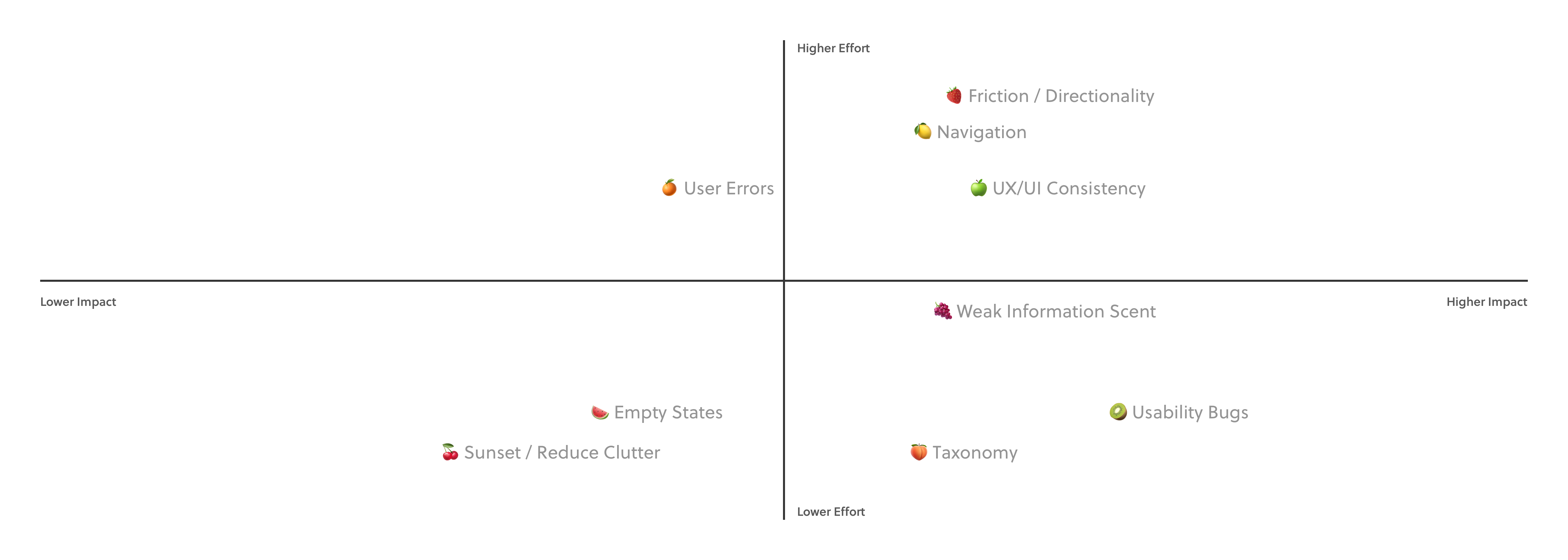
A list of “UX low hanging fruit” prioritized on a impact/effort matrix.
Standard Tasks are really a series of interconnected steps. Solving one step at a time would fail to solve the problem as a whole, therefore each task had to be approached as an epic.
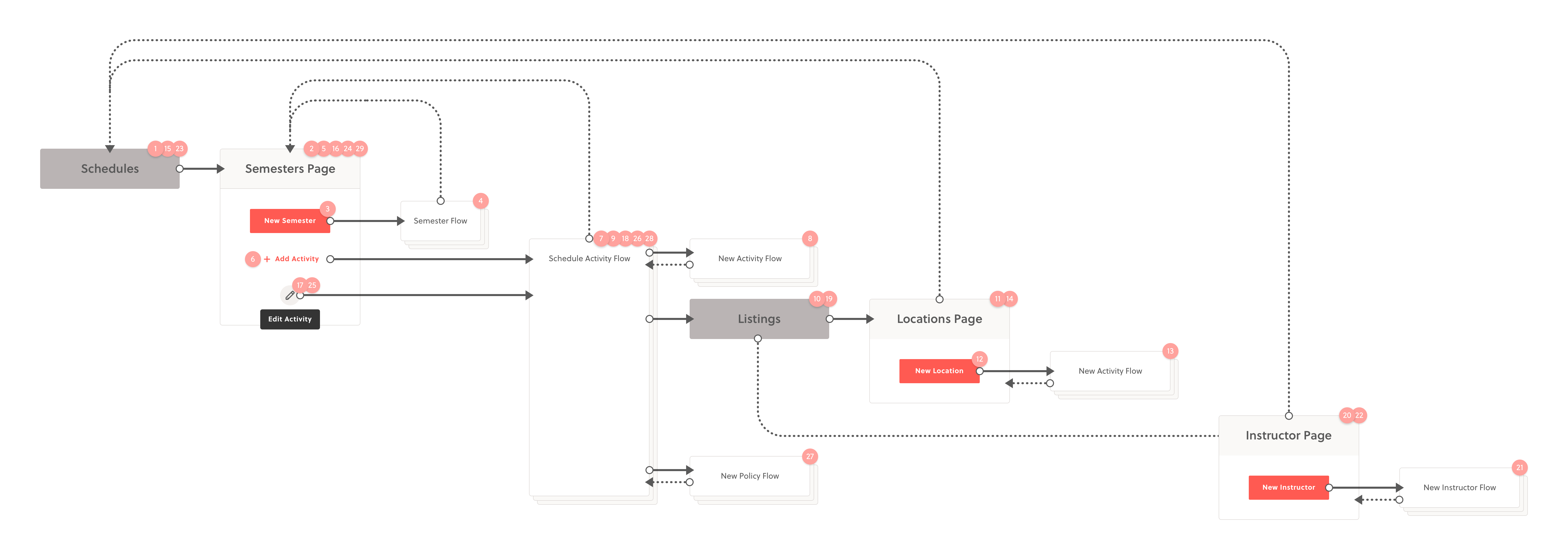
An example task flow for scheduling an activity. The current workflow takes place over 2 page sections, 5 isolated flows, and approximately 30-47 clicks.
RESEARCH & PRIORITIZATION
Identifying the Most Urgent Tasks
From an execution perspective, some of the “UX low hanging fruit” had dependencies and overlapped with the standard task redesign. To avoid redundancy, we needed to prioritize our tasks and understand more of the project scope before we began ticketing global problems.
I put together a research plan to identify the top priority tasks and came up with a formula that would help us quantify our insights for stakeholders.
Task Urgency = Task Length x Task Ease
Using a
survey, we listed a set of abstracted business tasks and asked our customers how much time per week they spent on them. We then asked, on a scale of 1–5, how easy the task was to perform. After receiving 121 survey responses, we analyzed the results and identified the highest multiples.
The 2 most urgent tasks were
scheduling new activities and
editing existing schedules, which conveniently had a lot of technical overlap.
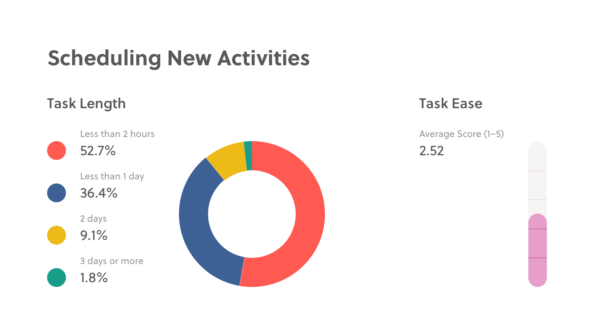
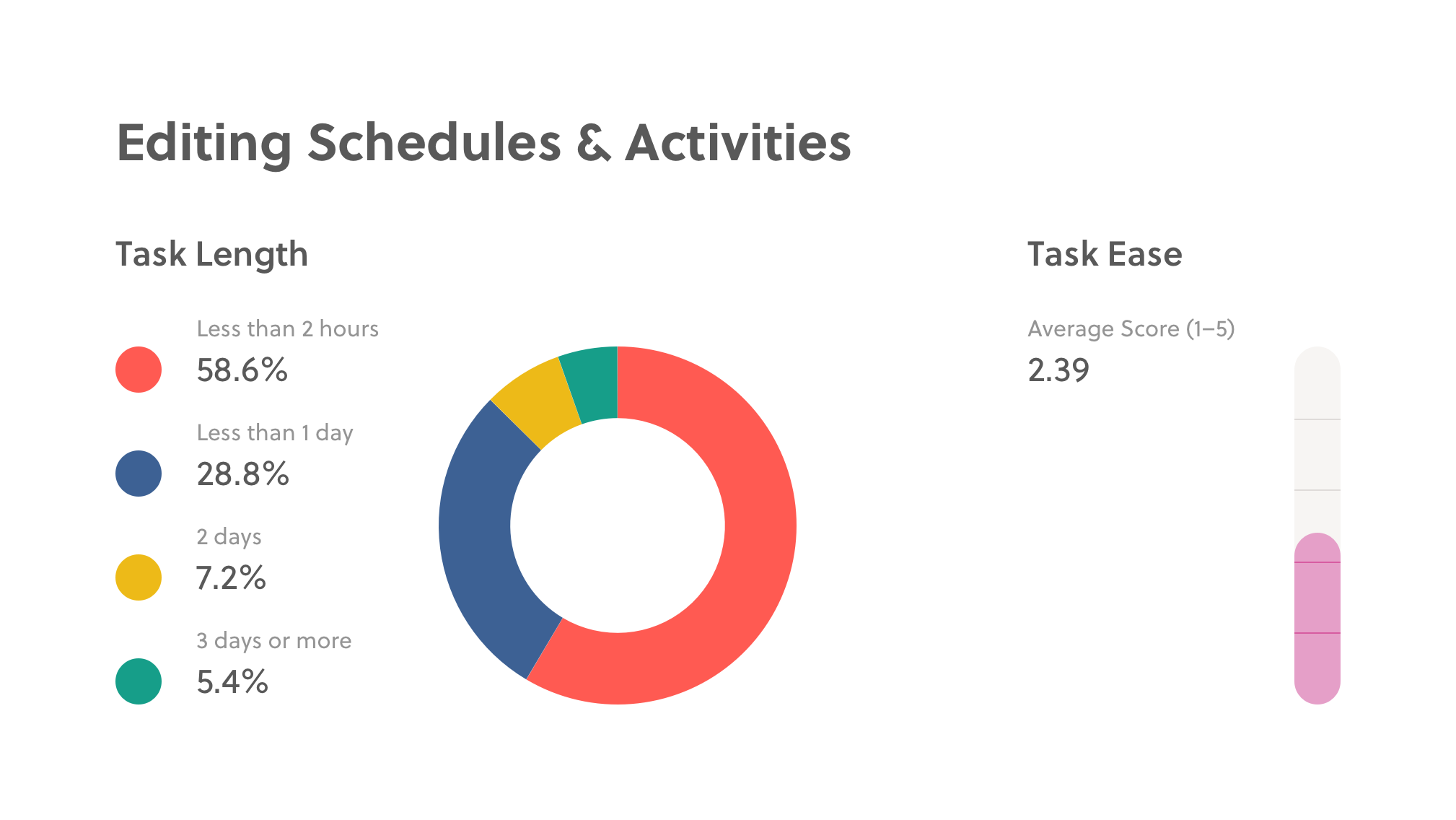
Scheduling new activities and editing existing schedules had the highest multiple and therefore, had the highest priority for solving usability problems in that domain.
DESIGN RESEARCH
Understanding the Human Problems with Schedules
Now that we had a focus area, it was time to delve further into the problem space. We conducted a round of interviews focused on schedule creation and management. Our research goal was to understand the existing usability issues associated with creating and editing schedules.
To make sense of our observations, we bucketed pain points into 3 distinct user contexts and created user stories to standardize the user problems up for consideration.
UNDERSTAND
Onboarding for the first time
CREATE
Setting up schedules
MANAGE
Making edits to schedules
Distinct user contexts helped us label when problems occurred throughout the journey.
While context, providers face problem, which causes pain point.
A template helped standardize our insights for easy comparison and grounded the observed problems in human terms. It also helped us envision a successful design—if pain points were mitigated, we'd have high confidence that we'd solved the problem.
UNDERSTAND
Making Scheduling Intuitive to Understand
In order to start taking registrations and making money with Sawyer, a business owner needs to schedule activities for purchase. This task is among the first set of actions a new user must perform and often represents the first impression with the software.
This task should therefore be intuitive enough so that a new user can complete it on their own with limited mistakes or reliance on the service team. New users should know what they can do, where to start, and if the tool will be a good fit for their business.
Below is the core problem we identified with schedule onboarding along with the solutions we came up with to solve it.
While onboarding, providers don't understand different schedule types, which causes scheduling mistakes.
Sawyer offers 2 scheduling configurations: semesters and camps.
Semesters recur weekly on a specified day throughout a timeframe, while camps recur daily for a selected number of days. Despite this critical distinction, there is no information about what each type means or how activities within them will behave.†
To solve for this problem, we merged the Semesters and Camps pages into a single index page. Instead of selecting a schedule type in the navigation menu, users would select the type during the first step of the "schedule activity" flow. This made available scheduling options more prominent so that it was noticed and understood.
† Understanding this distinction is especially important for a potential customer. A customer needs to see that Sawyer can meet the unique registration needs of their business in order to feel confident about their purchase decision.
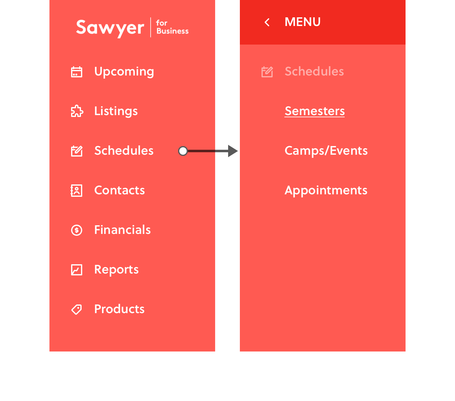
Previously, schedule types were split at the navigation level without descriptions or context. Selecting "Schedules" would point to "Semesters" by default and new users would have to learn via trial and error how each schedule type behaved.
Confusion was so common from this UI that Sawyer employed a designated onboarding team to build a customer's first schedule for them.
The updated navigation pointed to a combined schedules page where users could filter by schedule type.
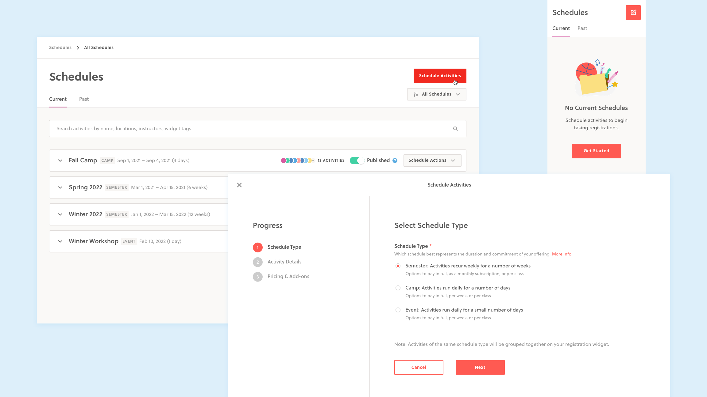
The new schedules page combined both schedule types on a single page. Selecting a schedule type as a required step introduced an opportunity for product education and clearly detailed how a user’s selection would impact their choices down the line.
CREATE
Making Schedule Creation Seamless
Once a new user has committed to Sawyer, they'll start scheduling the rest of their activities. This task can be a very time consuming and may take days to complete.
Ideally, we want the schedule creation process to be a fast, seamless, and non-repetitive so our customers can focus on content instead of the configuration.
Below is the core problem we identified with schedule creation along with the solutions we came up with to solve it.
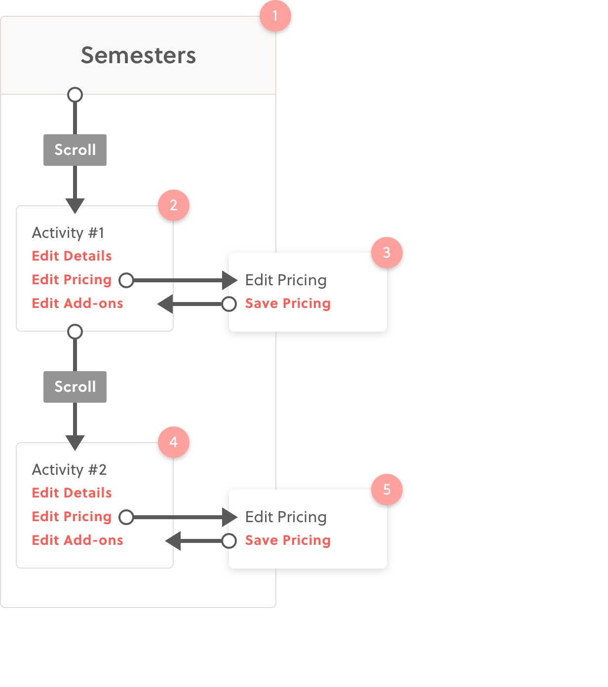
While setting up, providers need to create scheduling assets in different areas, which causes confusion about where to start and irritation from a disconnected workflow.
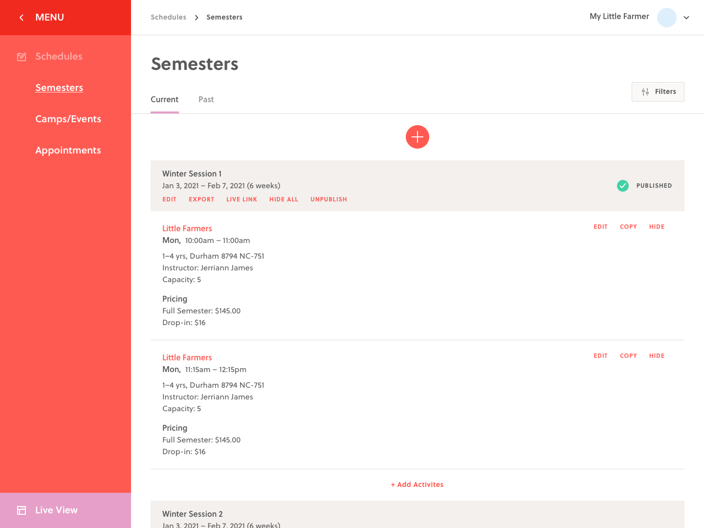
The scheduling interaction model was originally architected to mirror how inputs were stored in the database. Users were first required to create "Listings" ie. reusable concepts such as activities, locations, and instructors, in a separate section. Then, they needed to create a schedule, either a semester or camp, that represented the timeframe and commitment of their offering. The schedule acted as a "parent folder" for various activities that would run during that timeframe, and activities could only be scheduled once a semester had been created. Finally, users could put all the pieces together by adding activities to the schedules they created.
->
See the old create flow 💀
Unsurprisingly, this disconnected workflow was misunderstood by new users and dreaded by existing users. To solve for this problem, we flipped the workflow to make "scheduling an activity" a single, primary action:
1) Users could select or create new "Listings" from the details dropdowns, eliminating the need to jump back and forth between pages.
2) Schedules could be selected or created from the dropdown as well, making the activity scheduling process a single, linear workflow.
->
See the new create flow✨
->
See the create flow iterations ✏️
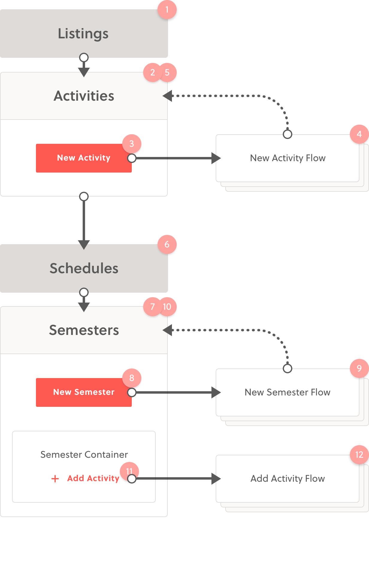
Scheduling an activity for purchase took place over multiple disconnected steps. Users could only schedule activities once listings (activities, locations, instructors) and a schedule (semester or camp) had been created.
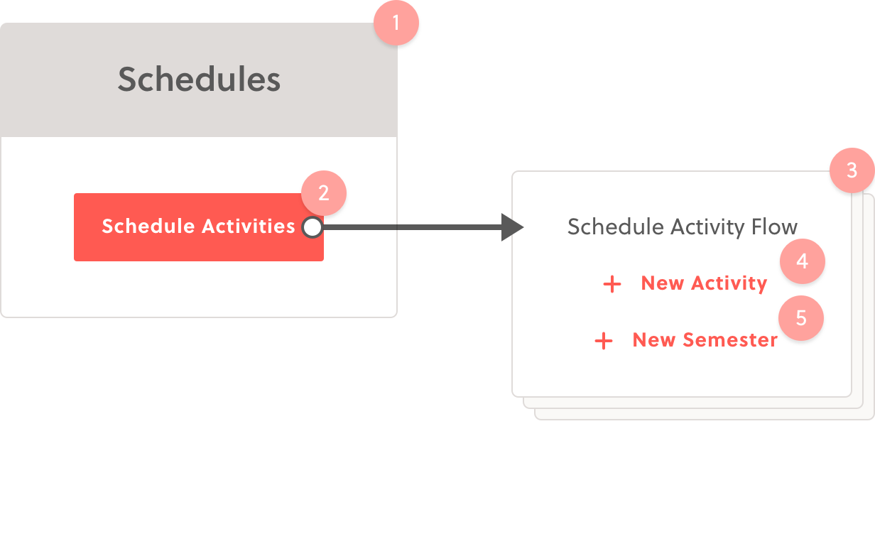
The new workflow is much more focused and linear.
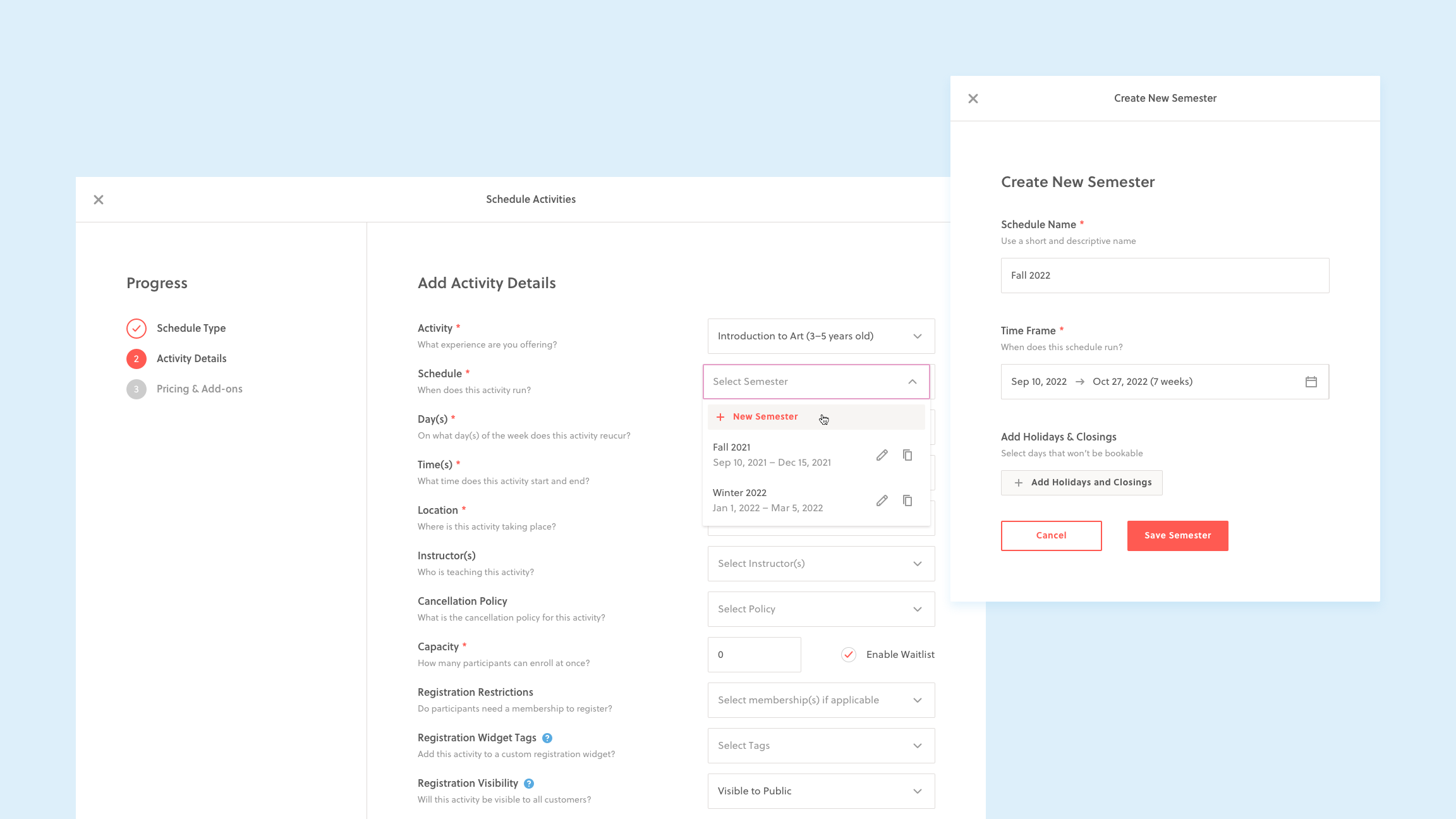
Schedule creation/selection was moved to the activity details page. This new workflow consolidated a disjointed 2 step process into a seamless scheduling experience. Users can now select, edit, duplicate or create new timeframes from the dropdown. This new architecture is proving to be more flexible as it opens up opportunities for batch creation and copying activities across schedules.
MANAGE
Making Schedule Management Quick and Precise
Activity edits are even more common that activity creation. Some of the most common scenarios include editing price based on the attendance, or overriding capacity to accommodate more students. Either way, the desired behaviour for this task is to be quick, easy, and flexible—especially while editing multiple activities at once.
Below are two of the problems we identified with schedule management along with the various solutions we came up with to solve them.
While making edits, providers can't find what they're looking for, which causes frustration from the time spent searching.
In our research, we learned that users find what they're looking for in one of two ways:
1) by scrolling, sometimes through hundred of scheduled activities
2) by searching, usually with the browser search (⌘+F)
To make "scroll finding" easier, we needed to update the UI. To start, we made schedule containers collapsible, which gave a higher level perspective and reduced both scrolling and page load time. At this level, we also added activity dots to give "shape" to the schedule and provide information scent to what's inside. We also updated the information design within the container, making use of hierarchy, contrast, visual cues, alignment, and grouping, all while keeping the same sequence in which the activities were created. Finally, a smaller nav bar opened up the page real estate to hold all the necessary activity information. The information design alone reduce "find time" drastically and even made comparison across activities easier.
To make "search finding" easier, we added a search bar at the top of the page that could query the most common data: activity name, location, instructors, and day of the week. The search results page showed matches that were editable.
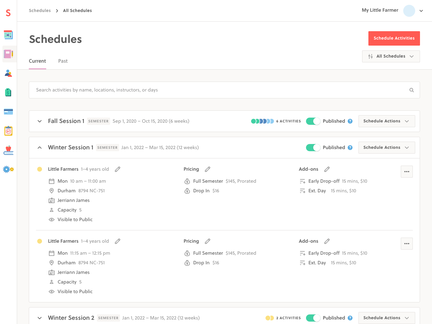
A comparison of the schedules page before and after the UI update. The old schedules page lacked hierarchy and proximity between related objects, making it difficult to glean relevant activity information or find what you were looking for.
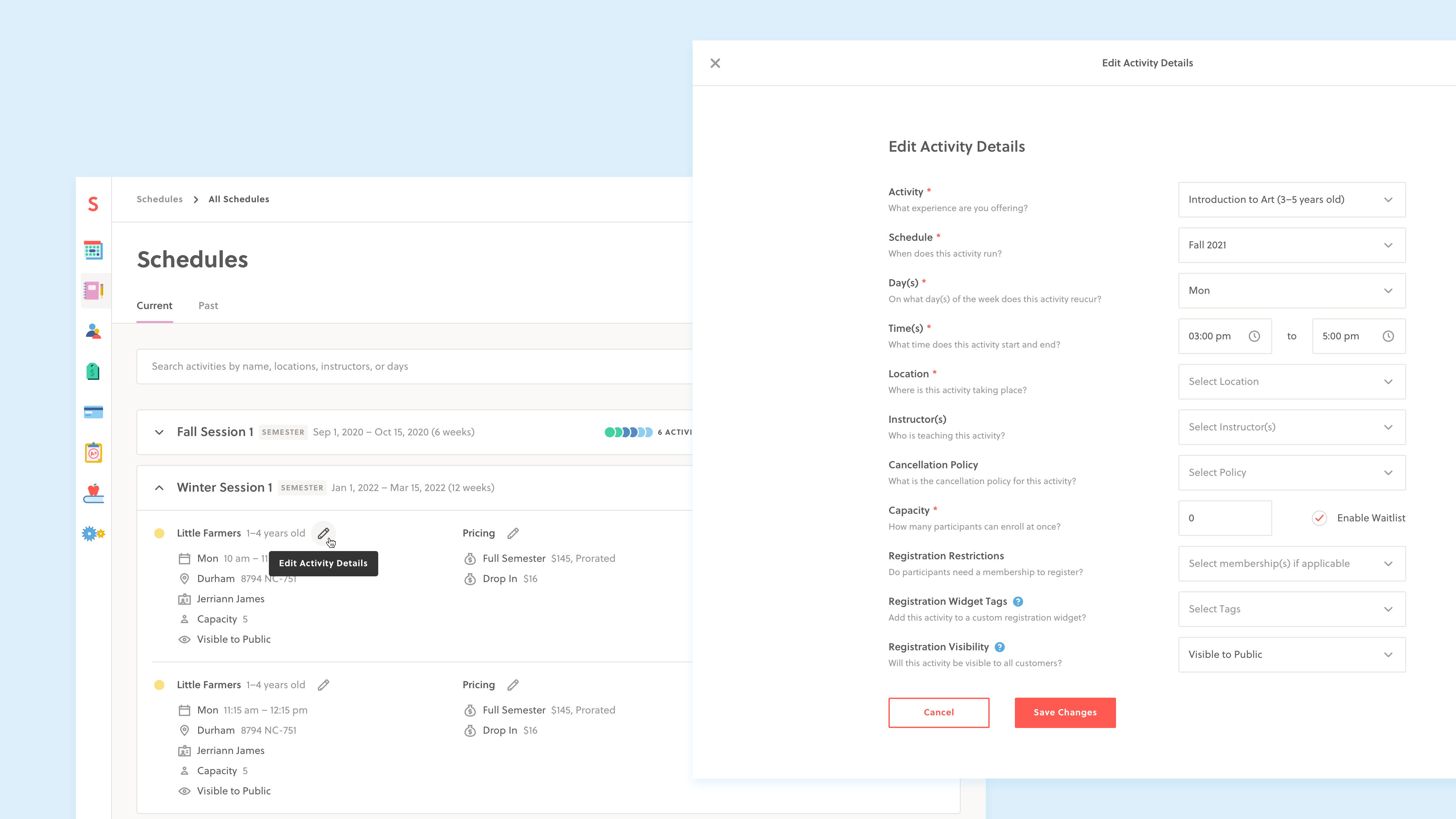
While making edits, providers require multiple steps to make a single edit, which is time consuming.
Activity editing was modelled after the activity creation flow because it uses the same inputs. However, both flows take places over multiple steps because some inputs have dependencies. Having to click through multiple steps to edit an activity becomes problematic when editing multiple items. To make matters worse, saving changes would reload the schedules page and users would lose the spot where they last left off. Changing the instructor or price on a large schedule with hundreds of activities could take all day to perform.
->
See the old edit flow 💀
To solve for these problems, we made each step editable. A user could edit the activity details, the price, or the optional add-ons and jump directly to those inputs. When saving their changes, they'd return back to where they left off, making it easy to edit the next scheduled activity.
->
See the new edit flow ✨
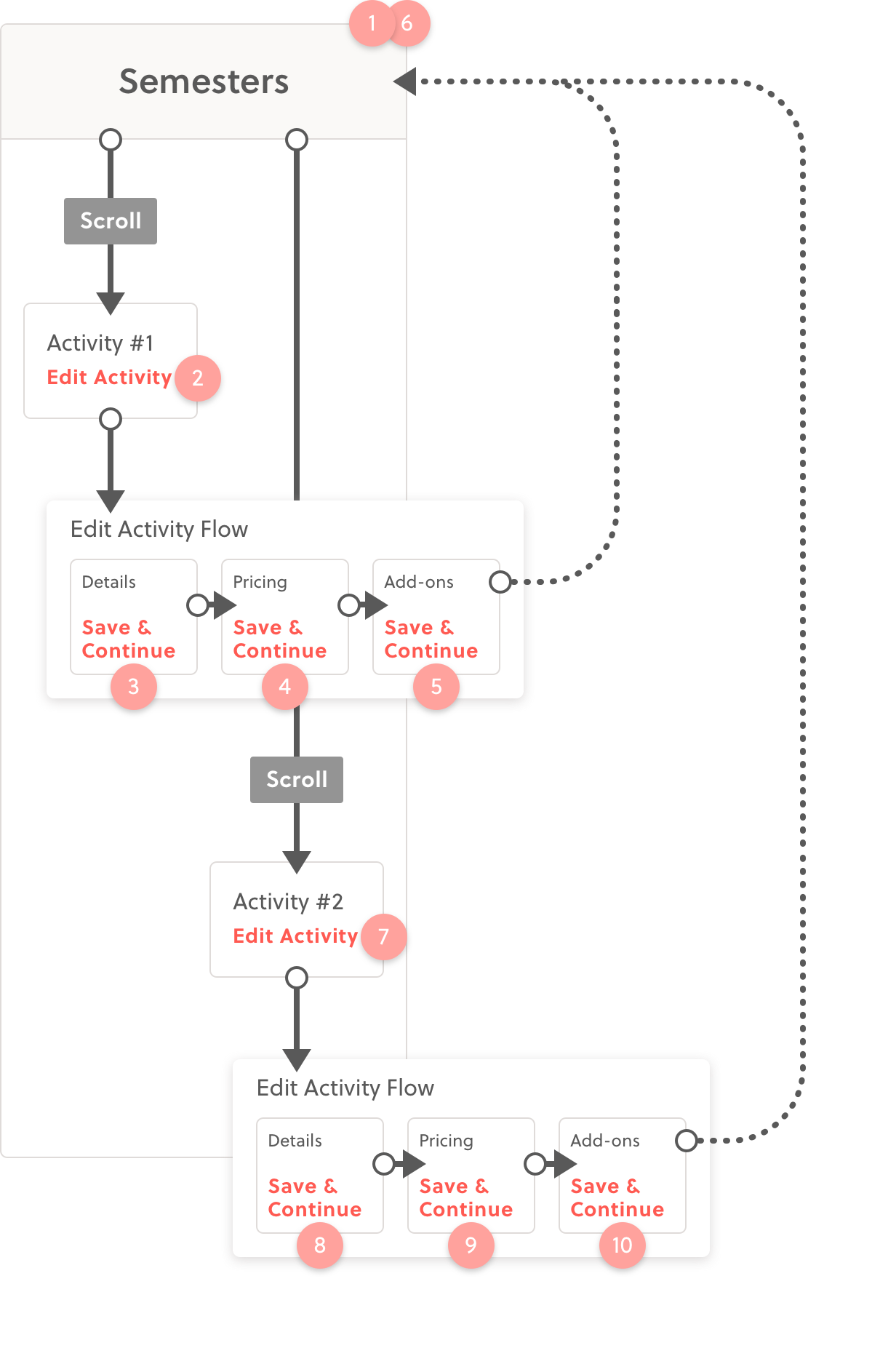
The old edit flow forced users to go through multiple steps.
New edit flow accomplishes the same task in half the amount of steps and a fraction of the time.